I'm interested in how sound and music can make data more engaging so I began playing with data auralisation (or sonification). This was partly inspired by The Hive at Kew Gardens, and partly inspired by a day spent shadowing a Coca Cola sales rep in Sweden as he tried to make sense of sales data while driving between customer visits.
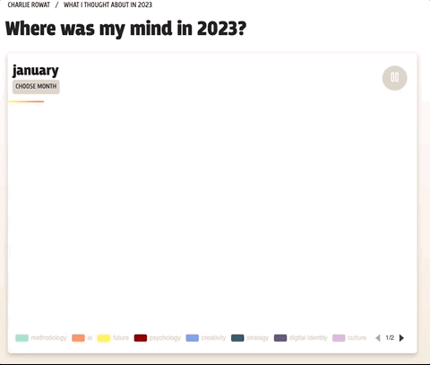
Where was my mind in '23?
This data auralisation tells the story of the things I was most interested in in 2023, and how my content consumption varied across the year.
The data is from my Obsidian vault, a place where I gather extracts and notes from blogs, academic papers, YouTube, podcasts, books, and audiobooks. So this only shows the things I thought were so interesting that I made notes on them.
For each of the top ten topics I consumed the most information about, I chose a diad–two notes–to represent it. The pitch at which the diad is played back varies depending on the source media: low pitches represent weightier sources, books or audiobooks, and higher pitches represent lighter sources like articles or podcasts. The 'noise' sound you hear plays when something I read wasn't in the top ten topics. And, hopefully obviously, time is represented by time. Each bar of music is one day.
To mix in an element of qualitative data (and because I think it sounds cool), I included a snippet from a podcast or audiobook I listened to each month.
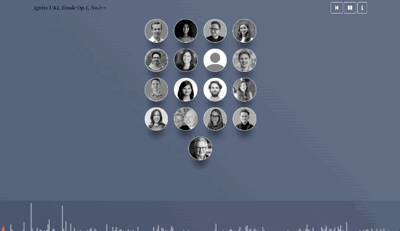
Ignite UKI, Etude Op.1, No. i++
What does collaboration sound like? I took a year of Slack messages in our team channel and turned it into music.
The lower the note, the more senior the sender. The longer the note, the longer the message.